.png?w=1350)
Moritz Stefaner and Christian Lässer
Since at least the 17th century, science has struggled with words. Francis Bacon, visionary of a new, experimental natural philosophy, called language an “idol of the marketplace”: a counterfeit currency we trade in so habitually that we no longer notice the gap between words and the world. True to its Baconian ideology, the Royal Society of London, one of the world's oldest scientific societies, made nullius in verba (roughly, “on no one's word”) its motto soon after it was established in 1660. Satirist Jonathan Swift parodied the Royal Society's suspicion of language in Gulliver's Travels, published in 1726: instead of conversing, some members of the Academy of Lagado carry around a sack of things that they exchange instead of words. Science aspired to show, not tell.
Yet science has never been speechless. Scientific journals also began in the 17th century, and since then, science has been all about communication—first and foremost between scientists and other scientists, but also with a broader public fascinated by the latest discoveries, inventions and speculations about fossils, electricity, atoms, computers, genes and galaxies. How to communicate about the world in words? Into the crack between words and things sprang images: woodcuts, engravings, lithographs, photographs, diagrams, graphics of all kinds. Modern science is ingeniously, intrinsically and extravagantly visual. No wonder “see” is a word whose popularity spans all 175 years of writing about science and technology in Scientific American.
On supporting science journalism
If you're enjoying this article, consider supporting our award-winning journalism by subscribing. By purchasing a subscription you are helping to ensure the future of impactful stories about the discoveries and ideas shaping our world today.
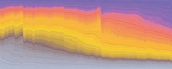
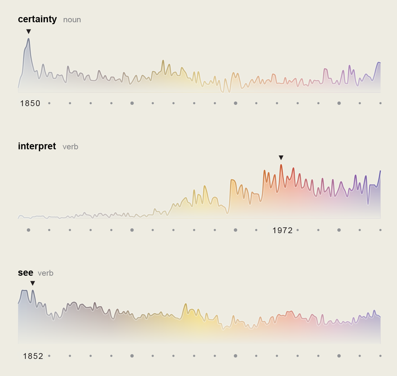
It is entirely in keeping with the visual spirit of scientific communication that the very words used in all 5,107 issues of Scientific American since 1845 should be turned into an image. Like the patterns in marbled paper, the word frequencies undulate, soaring and plunging as a function of time to track the way science talked about itself to itself. Epistemic virtues (which are to knowledge what moral virtues are to goodness) such as “certainty,” flanked by its boon companions “universal,” “rational” and “truth,” spiked in the middle decades of the 19th century, whereas clusters such as “imagination,” “intuition,” “conjecture” and “interpret” peaked suggestively between the 1950s and the 1970s. After World War II, when the most prominent scientists of the day—Albert Einstein, J. Robert Oppenheimer, Linus Pauling—reflected on the wider significance of their science for a nonspecialist audience, values and assumptions taken for granted in research journals came out into the open in the pages of Scientific American.
Just as revealing as the jagged peaks and troughs are the trajectories of words that have persisted over time: “average,” “exception,” “cause,” “experiment,” “observation,” “standard,” “skill” and, yes, “see.” Instead of the Alps, these word landscapes resemble gently rolling hills: they have their ups and downs, but for the most part they are as steady as the horizon. They represent the enduring practices of science that survive revolutions in theories and even shifts in epistemic virtues.
Scientific images are multipurpose tools: they represent things, relationships, even arguments. But just as a map does not duplicate the territory it represents, words do not mirror the world in every detail. Although the relative frequencies of words used are highly suggestive, they cannot convey the texture of the magazine issue by issue. A reader nowadays might wonder: Where are the women? Why are some fields of research missing? Who paid for science back then? No image can tell the whole story, if only because the story that interests us changes over time. When images do succeed, they enlist sight in the cause of insight—in this case, a rippling physiognomy of 175 years of science for the curious public. —L.D.
Moritz Stefaner and Christian Lässer

Moritz Stefaner and Christian Lässer

Moritz Stefaner and Christian Lässer (graphics), and Jen Christiansen (captions)
To learn more about how the data were collected, analyzed and visualized, see “How to Turn 175 Years of Words in Scientific American into an Image.” To search for your own favorite words and to explore other juxtapositions, visit “Explore 175 Years of Words in Scientific American.”